Analysing the real-time position public transport data in Turin
I have recently begun analysing a dataset of real-time positions of the vehicles of the GTT public transport operator in Turin, Italy. The dataset contained information of the position of each vehicle at a particular time, and the line and the number of the vehicle along a trip identifier.
The positions have been collected over the first two weeks of December 2023, and the total amount is about 21 million, from all public transport lines. You can see how many positions are collected at each minute in the figure below:
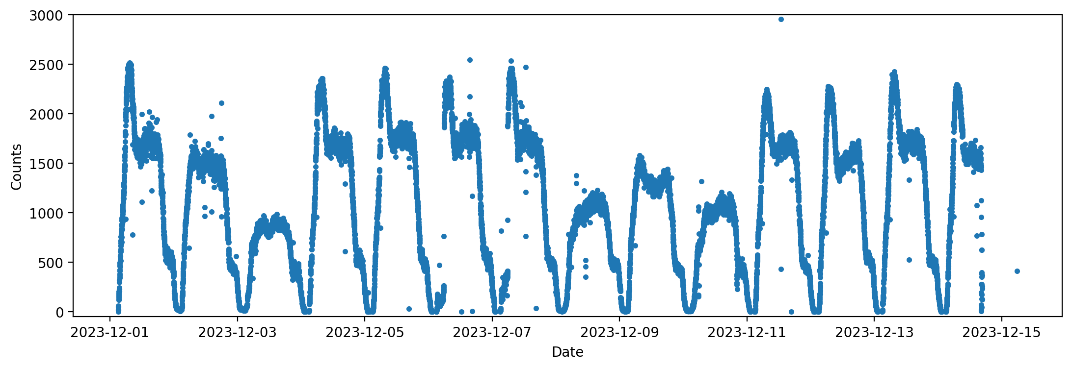
It’s curious to note that on the weekend the number of positions collected is markedly lower (the 3rd of December was a Sunday, and the 8th December is a national holiday in Italy).
Because of the very high number of positions, and of my ever-present interest in new programming languages, I decided to use Julia for this analysis, as it is very intuitive and fast.
Cleaning up the data
The dataset had to be removed of all spurious data points which could not be possibly explained. In fact, there are several points that were very far from Italy, or from Turin in general. Some trams GPS, were, for example, continuously jumping from Turin to Genoa for no apparent reason: this made for an average speed of more than 1000 km/h!
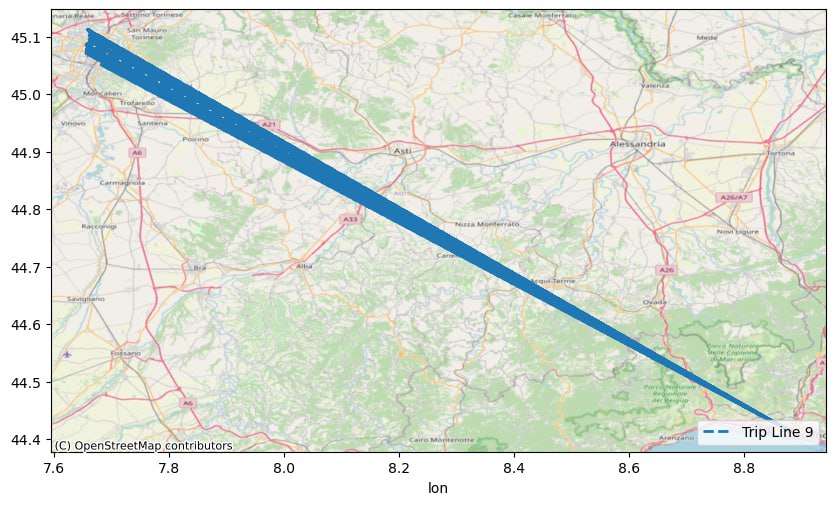
Therefore, I set to remove all positions with a distance from the center of Turin higher than 17.5 km. I also decided to discard any data points without a trip identifier, for reasons which will become clearer later.
Then, I separated the data by line, vehicle number and trip id, thus creating a trace of each vehicle on each trip. After cutting each trace when it jumped more than 500 m and by more than a minute and half, I had a series of traces for the trips, and I proceeded to analyse each line individually.
Line analysis
At this point, I had another problem: sometimes the data of the trace is not cut when the vehicle leaves service and goes to the depot. This is very evident in line 10, for example, whose trams make all the way from the center to the north depot of Venaria at night time.
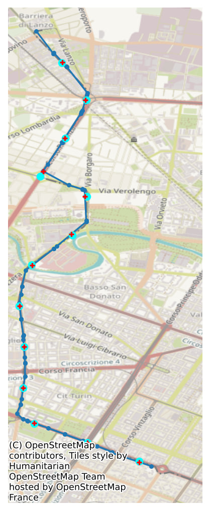
Therefore, I used the track information of each line, which is a polyline showing the general path of a line, and the list of stops the line makes. Initially, I split the polyLine into regular sections of 500 m: this was done by dividing the polyline in many small segments, then finding the one which passed the threshold each time. Obviously, there is not a perfect correspondance between the points where each section begins and the positions recorded for a vehicle. Thus, I inserted a new position in the vehicle trace for each section: since the trace is actually a collection of segments, in geometrical terms, it’s only necessary to split the segment at a new point closest to the section point. For the time of the new “recorded” position, working under the assumption of simple linear motion, I put the mean averaged by the distance between the two ends of the segment.
Below you can see an example on the map, with the line trajectory or polyline in grey, the section points in light blue, and the trace in blu with each of its point highlighted. The red crosses represent the new point that are inserted in the vehicle trace:
The polyline was also useful to the determine when the bus was leaving service and going to the depot: by keeping the vehicle positions within a small threshold of the polyline points (about 30 meters), the trace of the vehicle was well defined. The division is section made it possible to also distinguish when the vehicle was actually running in the direction opposite to that of the trip (from south to north in the previous example).
After this part was done, I was able to compute the average per section on each trip. This was done by computing the total distance travelled by each vehicle in each section, and the time spent in each section, and then diving them. What I’ve obtained now is a new coarse-grained dataset, for which there are also timestamps of each section/trip/vehicle tuple.
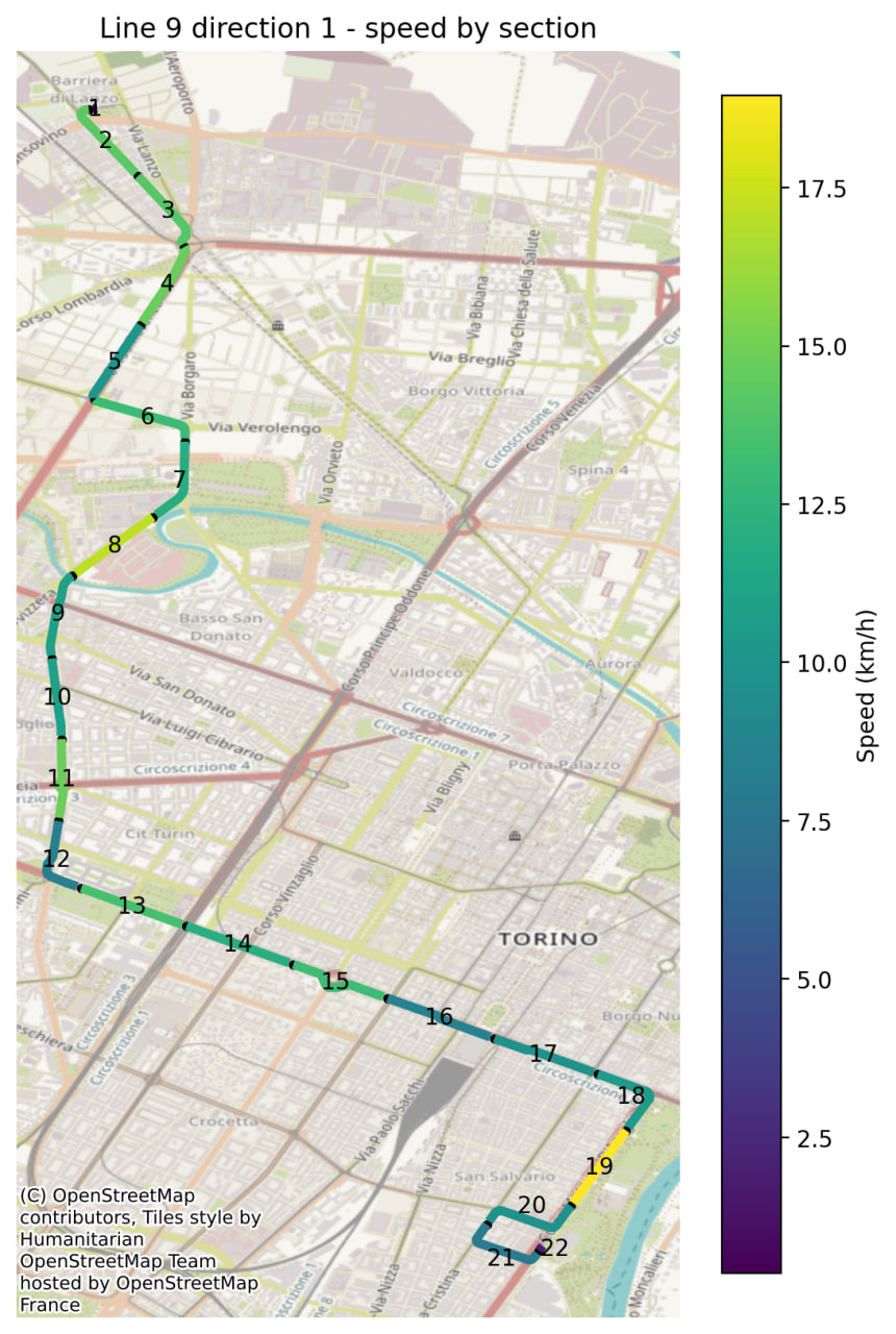
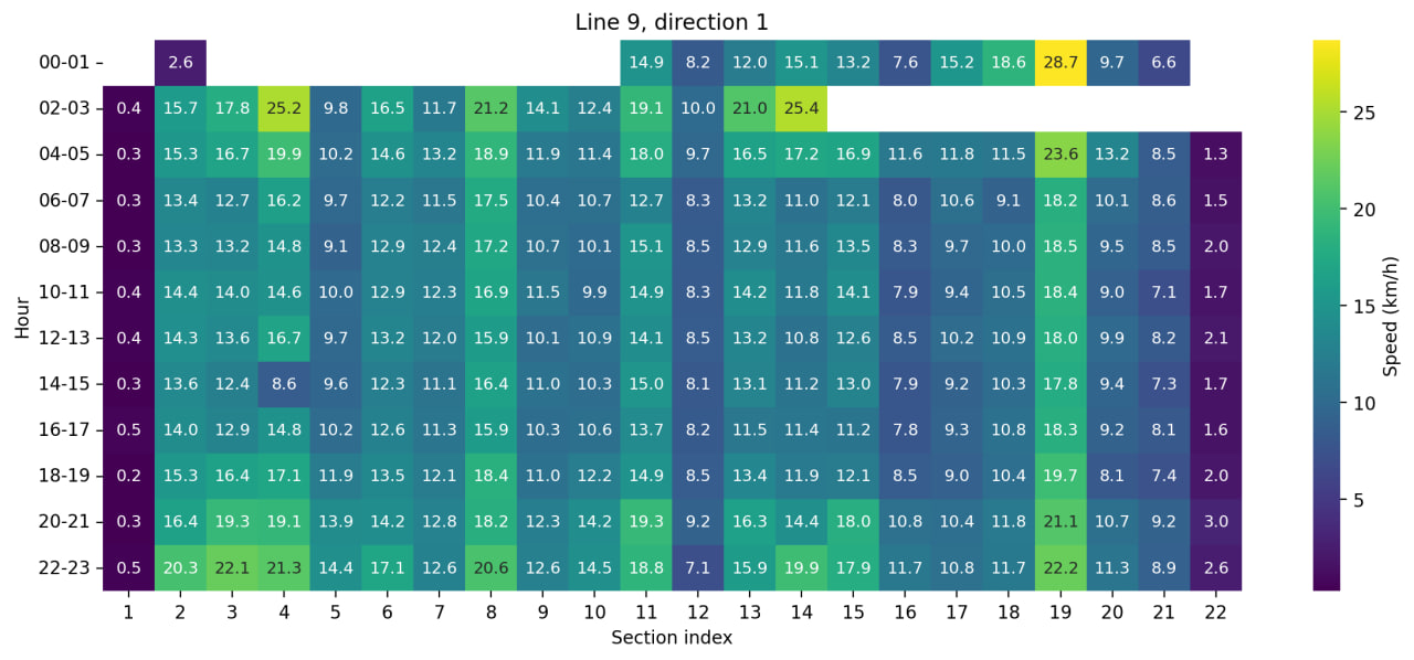
From this new dataset, I’ve obtained a few different results, averaging the speed on either just the section or the hour of the day. The two figures below show the average speed on the map, and for each section at each day.
From these two figures, it can be seen that the speed varies a lot depending on the part of the trajectory, and it’s unclear on which factors it depends. Since the 9 is a tramway line, it might be possible that the high speed of section 19 is due to the state of the tracks there (it’s completely separated by other traffic). However, the presence of close stops might also explain the low speed of other sections.
Future outlooks
So far, I’ve only done this analysis on line 9, and I think it’s really cool to see the real (although, averaged) speed of a public transport line. I think that the ability to look at different times during the day is also important, and one interesting question that remains to be answered is whether the physical separation is helpful in keeping an higher average speed in the public transport. The answer should be “yes, of course”, but I’d be quite cool to see it from the data.
Moreover, it would be interesting to see if there is a difference in average speed between the hours of high peak traffic, and the hours of low traffic. These questions could be answered also by extending the analysis into several weeks of data.
P.S. I’ve published the code for the analysis on Github, available here.
Enjoy Reading This Article?
Here are some more articles you might like to read next:
