Making isochrones with OpenStreetMap data and GTFS
Isochrone maps (or simply, isochrones) are a way of of showing all the locations that are reachable, starting from a certain point, within a certain time. They’re often made to show how far one can travel by car or by bike, and I first encountered them when reading about public transport in OpenTripPlanner. This is a wonderful open source software that, given the appropriate data, can calculate the best way of moving from one place to another with public transport, much like Google Maps does. I tried it out with the data for Turin, Piedmont, and it’s really fast and easy to setup (after figuring out which data to download, that has to be from OpenStreetMap for the road network and GTFS for the public transport, but more on that later).
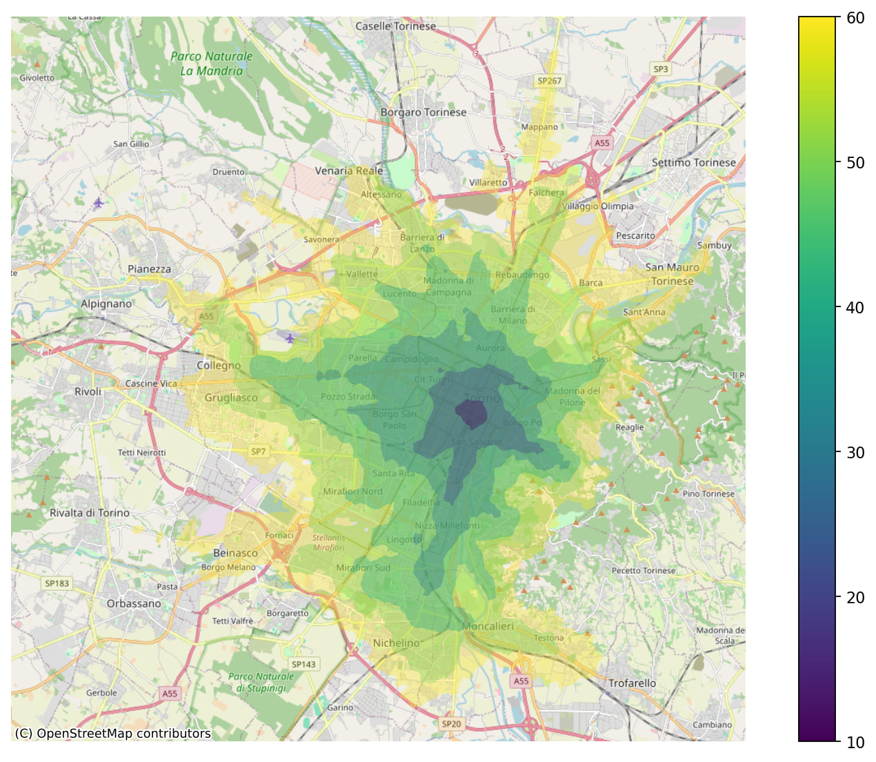
After digging around, I discovered that OpenTripPlanner can also make isochrones, via an API that is a bit hidden in the documentation. My guess is that it was actively used before, but since the project has recently undergone some changes, it’s now not that important any more. After downloading the GTFS data of Gruppo Torinese Trasporti from AperTO, I tried computing an isochrone starting from the station of Torino Porta Nuova, on the 16th January 2024 at 20:40, and I obtained the following result:

The layers here correspond to having travel times lower than 10, 20, 30, 40, 50 and 60 minutes from the initial point, with lower times with darker color. While this looks okay, I was soon made aware that, in fact, it was a little wrong, as going from Porta Nuova to Fermi (near Collegno) would take about 25 minutes with the underground, but on the map was shown between 30 and 40 minutes. Of course, my interest was immediately piqued, and I had to compute an isochrone map by myself.
Downloading the data
In order to compute the isochrones more accurately, I had first to download the OpenStreetMap (OSM) network, but the problem is that it is huge and very detailed, and I would have had to manually remove all useless information.
Luckily, I found the OSMnx Python library, that made it possible to download only the relevant part of the OSM data, which is the walk network. It is still a very large network (~190k nodes), and this called for some simplification to be done. At the end, I decided not to use the tools provided by OSMnx, as they were removing too many nodes (and replacing links with geolocated paths, which would have complicated the calculation). In fact, the main reason is that, while the downloaded network was a directed weighted graph, but fully symmetric (as it should be when walking), after the simplification methods were applied, some nodes were assigned two different paths between them, which were not even symmetric!
Instead of doing this complex kind of optimization, I just decided to remove the nodes which were inside a chain (so, having degree 2) whose neighbors had a total distance of less than 50 meters (so, summing the weights of the links to that node). At the end, I managed to remove about 20k nodes, going down to a size of ~170k total nodes.
Writing the algorithm
For this project, I was really tempted to use the Julia programming language again. Since I wasn’t able to read the full OSM network from the GraphML file in which I saved it from python, I had to simply save the nodes information and the edges list separately in Parquet data frames. Everything was going well: once the OSM graph was reconstructed, the stops had to be added to the graph (to better compute the distances from one stop to the other). Here is when I encountered a problem: I wanted to find the points closest to the stops, and in order to it efficiently I decided to use a k-d tree. Unfortunately, the Julia implementation of k-d tree got stuck when I fed it the ~170k points from OSM, so… I had to use Python (the scipy version worked great!).
So, at the end I had the following ingredients:
- a graph of all the points in the map, plus the stops, to compute the distances in meters from one point of the graph to all the others
- a kd-tree of all the OSM points (to find the closest one to the starting point I picked)
- the GTFS data, which was describing all the public transport trips
I will now discuss each point separately, starting from the one I’ve never described until now.
Extracting the trips information from GTFS
The Google General Transit Format Specification is a very flexible standard to describe public service options. It’s now used worldwide, and is tightly integrated into Google Maps (of course!). I was able to find the data for buses and metro of Torino, but not the one for local trains (operated by Trenitalia). In fact, if any individual working for Trenitalia is reading this now, please find a way to distribute the transit data!! It’s totally unfair that Google has access to it, but it’s impossible to find for everybody else.
On the practical side, the most important table from GTFS is the stoptimes, which links trips and stops with the time of arrival/departure (for GTT, they are the same). However, in order to distinguish which trips are actually made on a particular day, it’s necessary to use the calendar and calendar_dates, that show the service days. If it’s important to know which public transport line is taken (like giving directions), then of course the routes table is fundamental. The trips table is needed to link the service days with the trips.
Once a day is selected, all of the information from GTFS can be contained in a single table/dataframe, which is a selection of the stoptimes with only the active trips of the day.
The street graph and the k-d tree
The street graph is central to the algorithm, as each time a public transport user gets off a bus, he/she needs to know how distant all the places around him/her are. The important idea here is that this is needed at each stop a person can get off, thus, the graph distances can be precomputed only for these nodes (there still are ~4500 stops, but try saving a 170k * 170k matrix!). To compute the shortest distance, I’ve used the Dijkstra algorithm, since the distances in the edges can only be positive.
As mentioned above, the k-d tree is needed only to find the closest node of the graph to the starting point, and this is the only time I’ll have to run the shortest path for the whole time. Nice!
Putting it all together
With the precomputed distance matrix, the filtered GTFS stop times, the network and the k-d tree it’s now possible to find the time taken to reach all the points in the graph using public transport (with a few extra hash tables for fast lookup of stop nodes ids). To avoid continuously all stops, it’s possible to track their total reaching time in a priority queue.
The idea is to get the stop with the lowest arrival time (which hasn’t been checked yet), find the trips that start from that stop, then find all the stops that can be reached by the each trip, and check if the time of arrival is lower than the one previously saved. If it is, put the arrival stop back in the queue with the new arrival time, and then update the time taken to reach all other points from that stop (only if it’s lower, of course).
By repeating the steps in the above paragraph until there are no more stops to check, we can be sure that there are no trips that take a lower time to get to any single point. At the end, we get a vector representing the time taken to reach each point in the (extended) street graph.
Visualizing the result
In order to show the isochrone map, I tried using the geopandas library at first, to group together all the points that can be reached with a set time. This led to the problem of defining the outline of the reachable area, which turns out is intrinsically linked to the concave hull problem. I found a fast and reasonably good library for this calculation, but this was at times imprecise.
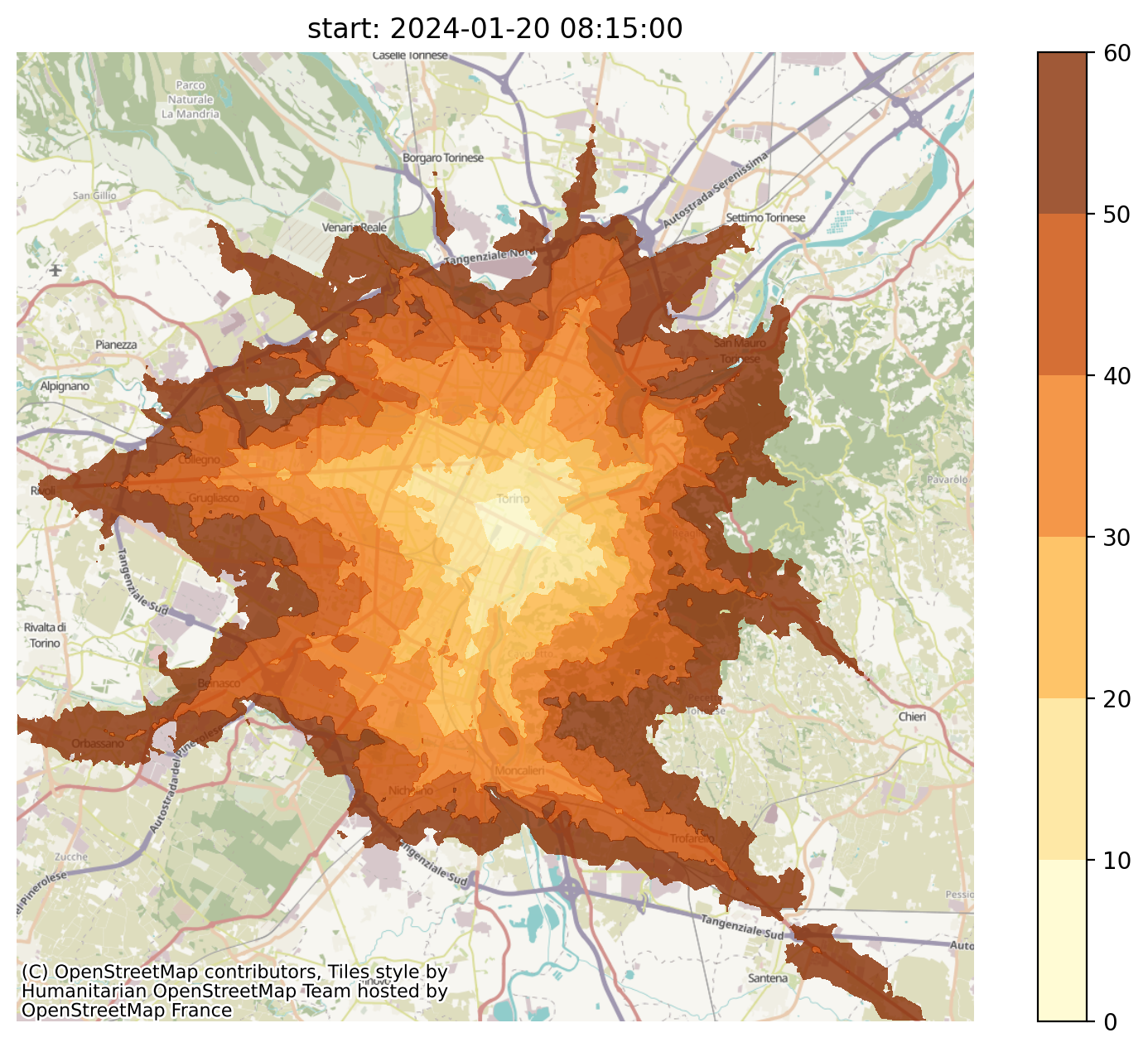
After some online digging, I found that the matplotlib library had all the tools I needed. By re-elaborating on this example, I was able to get very good-looking isochrones, like the following (still starting from Porta Nuova station):

Looking at this picture, it’s possible to conclude that the previous isochrone map made by OpenTripPlanner wasn’t entirely wrong: in fact, the area around the “Fermi” underground station is under 30 minutes, but it’s also very small, which could explain why the (probably more approximated) method used by OpenTripPlanner missed it.
I have run the algorithm on a randomly-chosen day (20th January), with starting time varying from 5 am to 1 am in the following day (which is the same service day for GTFS), and have published all the images obtained, along with the code, in a Github repo.
Extra: number of trips taken
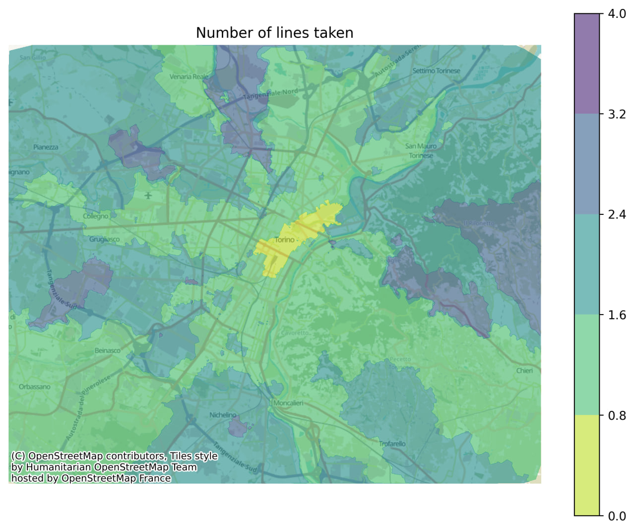
With a simple (but not entirely trivial) modification, I was able to track the number of trips that are needed, at least, to reach a certain point. One trial result is shown below:

Enjoy Reading This Article?
Here are some more articles you might like to read next: